Conference posters remain a staple in scientific communication, acting as a bridge between complex research and accessible storytelling. The figures you include are often the first thing viewers notice, and they play a central role in conveying your message swiftly and effectively. A well-crafted figure not only highlights your key findings but also helps your work stand out in a sea of posters.
However, creating effective poster figures isn’t always straightforward. You need to balance clarity, detail, and aesthetics, all while making sure your visuals can be understood by a diverse audience. That’s where thoughtful design and the right tools come into play. By focusing on essential elements and leveraging new technologies, you can make your research both memorable and impactful.
In this guide, we’ll cover the critical elements every conference poster figure should have, common pitfalls to avoid, and best practices for designing figures that get noticed. You’ll also discover how Illustrae’s AI-powered platform can take your illustrations to the next level, saving you time while ensuring professional quality.
Essential Elements of a Conference Poster Figure
Creating a compelling conference poster figure means blending scientific accuracy with clear, engaging visuals. Here are the foundational elements that every effective figure should include:
Clear and Concise Title: Your figure should have a descriptive title that summarizes the key message. Remember, "The title of a poster should be at least 100 pt font size to be readable from a distance." For even more impact, "Using a sans serif 85pt font for the title ensures visibility from 5 meters away." This draws viewers in and gives context immediately.
High Resolution and Quality: Blurry images can undermine the credibility of your research. "High-quality figures should have a resolution of at least 300 dpi to ensure clarity and readability." This is crucial for both print and digital displays. "Figures should be high quality and high-resolution images, typically with a resolution of 300 dpi."
Legible Labels and Text: Axes, legends, and annotations should use large, readable fonts. Avoid cramming too much information, and stick to simple, direct language.
Logical Layout: Arrange elements in a way that guides the viewer’s eye naturally. Typically, left-to-right or top-to-bottom flows work best, mirroring how people read.
Color and Contrast: Use colors to highlight important features but stay mindful of accessibility. "Approximately 5% of the population is color blind, so avoid using red and green together in figures." Opt for colorblind-friendly palettes and make sure there is sufficient contrast.
Legend or Key: If your figure uses colors, shapes, or patterns to distinguish data, always provide a clear legend. This helps viewers interpret your visual quickly.
Minimal Clutter: Focus on the essential data. Too many decorative elements or unnecessary text can distract rather than inform.
Nailing these basics will ensure your figure communicates your research clearly, while also making your poster visually appealing and accessible.
Common Pitfalls to Avoid in Poster Figures
Even seasoned researchers can fall into some common traps when designing conference poster figures. Being aware of these pitfalls can help you avoid them and ensure your poster gets the attention it deserves.
Low Resolution Images: One of the most frequent errors is using images that are too small or pixelated. This not only looks unprofessional but also makes it hard for viewers to interpret your data. As cited, "High-quality figures should have a resolution of at least 300 dpi to ensure clarity and readability."
Overcrowded Figures: Trying to fit too much information into one figure can overwhelm your audience. Keep it simple and focus on the key message.
Poor Font Choices and Small Text: If the text is too small, attendees won’t be able to read your labels or legends from a reasonable distance. Remember, "The title of a poster should be at least 100 pt font size to be readable from a distance."
Problematic Color Combinations: Using colors that are hard to distinguish, especially for those with color vision deficiencies, can make your figure confusing. "Approximately 5% of the population is color blind, so avoid using red and green together in figures."
Lack of Context: Figures without clear titles, legends, or labels leave viewers guessing. Make sure every figure stands alone and is easy to interpret without additional explanation.
Ineffective Use of Space: Leaving too much white space or awkwardly placing figures can make your poster look unfinished. Balance your layout for a clean, professional appearance.
Avoiding these mistakes ensures your poster figures work for you, not against you, and help you communicate your research effectively to a wide audience.
Design Principles for Effective Poster Figures
Great figures don’t happen by accident—they follow core design principles that help viewers understand your message quickly. Here’s what you should keep in mind when crafting your next conference poster figure:
Simplicity: Less is often more. Strip away unnecessary details and focus on a single key message per figure. If you have multiple findings, consider separate visuals for each.
Hierarchy: Guide the viewer’s eye by emphasizing the most important parts of your figure. Use size, boldness, and color to create a visual hierarchy.
Consistency: Maintain consistent color schemes, fonts, and line styles throughout the poster. This helps your figures feel cohesive and professional.
Alignment and Spacing: Align elements neatly and use even spacing to keep your figures organized. A tidy layout makes your poster easier to scan and more appealing.
Accessibility: Design with all viewers in mind. Use high-contrast color schemes and avoid problematic color pairings. "Approximately 5% of the population is color blind, so avoid using red and green together in figures."
Annotation: Use arrows, labels, and brief annotations to highlight critical data points or processes. This directs attention and provides context.
By following these design principles, your poster figures will not only look great but also effectively communicate your research, making your work stand out at any conference.
Leveraging Technology for Enhanced Figures
Thanks to advancements in digital tools, creating high-quality scientific figures is easier than ever. Platforms like Illustrae offer a suite of AI-powered features to fast-track the illustration process—without sacrificing quality or detail.
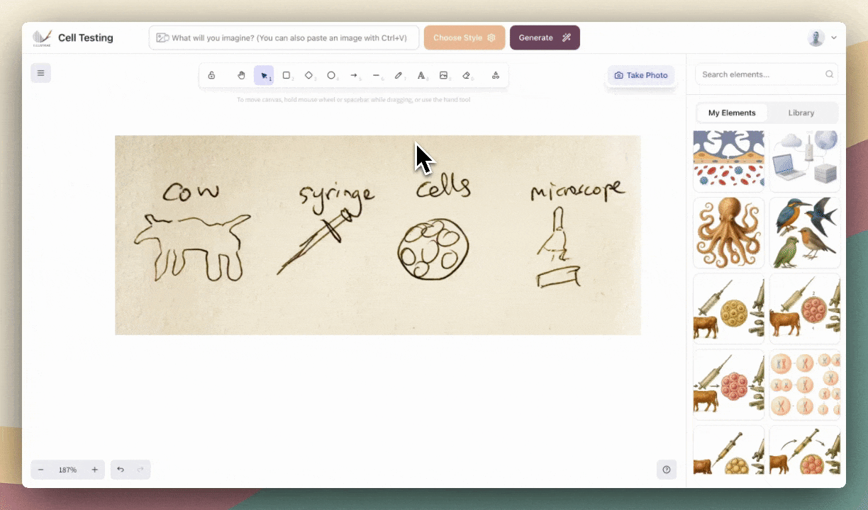
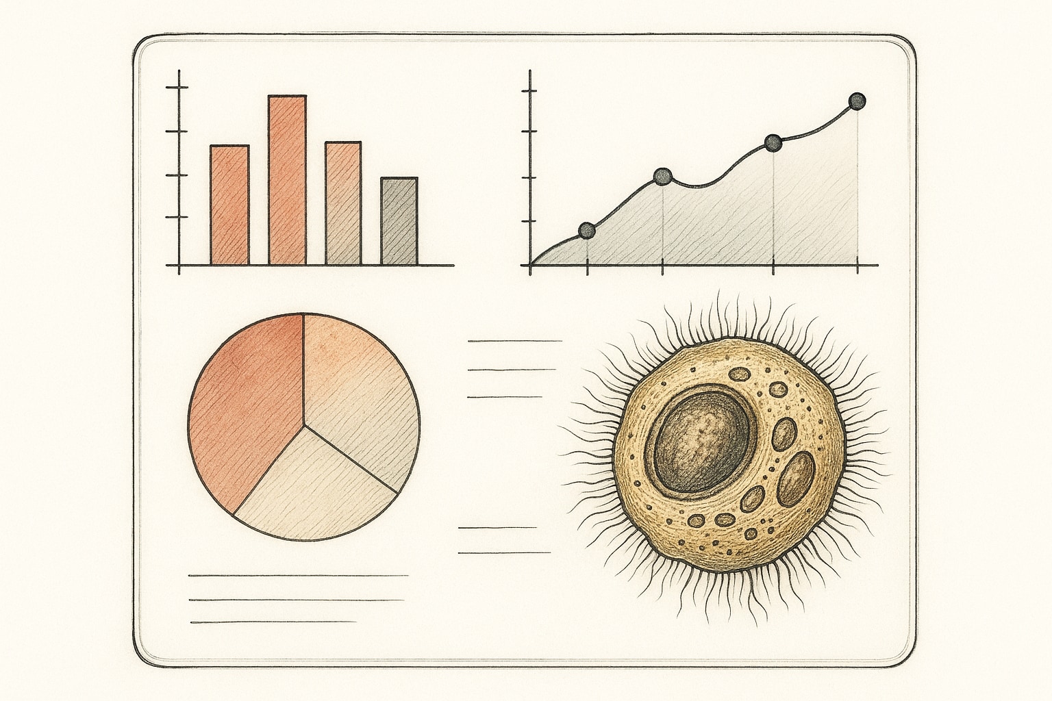
With Illustrae’s Intelligent Canvas, you get access to an infinite canvas that supports intuitive editing features. Add frames, arrows, textboxes, and even live embed links to make your figures interactive and dynamic. The real game-changer, though, is the custom element generation. Just describe what you need—like a molecular structure, cell process, or experimental setup—and Illustrae’s advanced AI will create a unique, scientifically accurate illustration in under a minute. You can also start from a text prompt, a quick sketch, or even an uploaded photo from your phone.
Editing is simple, too. Need to tweak a color, add annotations, or insert new elements? Just use the prompt bar to describe your changes (for example: ‘Make the cells pink’ or ‘Add arrows and labels between each step’), and Illustrae’s AI imaging technology will handle the rest.
This technology streamlines the process, so you can focus on your science instead of wrestling with design software. For more information about these features, check out https://illustrae.co.
Conclusion
The figures on your conference poster are more than just decorations—they’re powerful tools for communicating your research quickly and effectively. By focusing on clarity, accessibility, and strong design principles, you can create visuals that capture attention and invite conversation. Avoid common pitfalls, leverage modern tools like Illustrae, and your poster will stand out for all the right reasons. With a little planning and the right resources, your scientific story will shine.