Crafting a conference poster is more than just putting your research findings on a big sheet of paper. It’s about telling a clear, compelling story at a glance, catching people’s attention in a busy hall, and sparking productive conversations about your work. Whether you’re a first-timer or a seasoned presenter, knowing how to make your poster visually striking and scientifically accurate is crucial for standing out at your next event. In this guide, we’ll break down every step you need for a winning research poster in 2025, from planning content to final presentation tips.
How To Make A Conference Poster For Your Research: 2025 Guide
Understanding the Purpose of a Conference Poster
Before diving into design or content, it’s important to understand why conference posters matter. Unlike full manuscripts or oral presentations, posters provide a succinct overview of your research, designed for quick consumption and easy engagement. Their main goal is to visually communicate your study’s key messages, invite questions, and foster networking opportunities.
A conference poster serves as a visual abstract of your research. Its job is to summarize your objectives, methods, results, and conclusions in a format that can be absorbed in just a few minutes. Think of it as a conversation starter rather than a full report. You want attendees to grasp your project’s importance and ask you follow-up questions.
Effective posters strike a balance between informativeness and visual simplicity. You don’t need to include every detail—focus on the most impactful findings and use visuals to communicate complex ideas. The best posters make your research accessible to experts and non-experts alike, promoting broader interest and collaboration.
Planning Your Poster Content
Successful conference posters start with thoughtful content planning. Before opening any design software, outline your poster’s structure and decide what key points you want to highlight. This not only helps with clarity but also makes the design process smoother.
Start by identifying your poster’s main message. What is the one thing you want viewers to remember? Build your content around this core idea. Next, organize your information into clear sections, which typically include:
- Title: Concise and descriptive, it should quickly communicate your research topic.
- Authors and Affiliations: List everyone involved and where the research was conducted.
- Introduction/Background: Briefly set the stage for your research question.
- Methods: Summarize your approach, focusing on what’s novel or important.
- Results: Highlight your most important findings with visuals.
- Conclusions/Implications: What do your results mean? Why should people care?
- Acknowledgments & References: Optional, but recommended for credit and context.
Be mindful of word count. Posters typically employ around 800 words (and no more than 1000 words) of text. This ensures your poster remains readable and approachable. Remember, conference attendees will be reading your work from several feet away, often while navigating a crowded room. Less is more.
Finally, choose language that’s direct and jargon-free when possible. Explain concepts as if you’re addressing an informed peer from a different field. This broadens your poster’s appeal and helps spark interdisciplinary conversations.
Designing an Effective Layout
Now that you’ve outlined your content, it’s time to think about layout. An effective poster layout guides the viewer’s eye naturally through your research story. It should be organized, visually balanced, and easy to scan.
Experts suggest that a good balance for your poster design is 20-25% text, 40-45% graphics, and 30-40% empty space. This approach makes your poster visually appealing and ensures important points don’t get lost in a sea of words. Approximately 40% of your poster should be white space to make it visually appealing and easy to read from a 4-6 foot distance.
Here are some key layout best practices:
- Logical Flow: Arrange sections in a sequence that mirrors your research process—typically left to right or top to bottom. Use headings, arrows, or numbers to guide the reader.
- Readable Fonts: Use no more than two typefaces and ensure the main points can be read at eye level. Sans-serif fonts like Arial or Helvetica are ideal for clarity.
- Consistent Spacing: Use even margins and spacing between sections to avoid clutter. Group related information together for easy navigation.
- Hierarchy: Make your title large and bold. Section headings should stand out, while body text remains legible but unobtrusive.
- Color and Contrast: Use a simple color palette that enhances readability. Avoid overly bright backgrounds or clashing colors that distract from your content.
Don’t forget accessibility—use high-contrast text for readability, and avoid color combinations that are challenging for colorblind viewers. A well-designed layout helps your research shine and invites viewers to engage.
Utilizing Visuals and Graphics
Visuals aren’t just decorations—they’re central to how conference posters communicate. Strong graphics can condense complex data, emphasize trends, and make your poster memorable. Remember, “A research poster should be 20% text, 40% visuals, and 40% white space.”
Here’s how to make your visuals work for you:
- Graphs and Charts: Use these to summarize quantitative data. Opt for clear labels and legends, and avoid unnecessary 3D effects or colors that distract from the message.
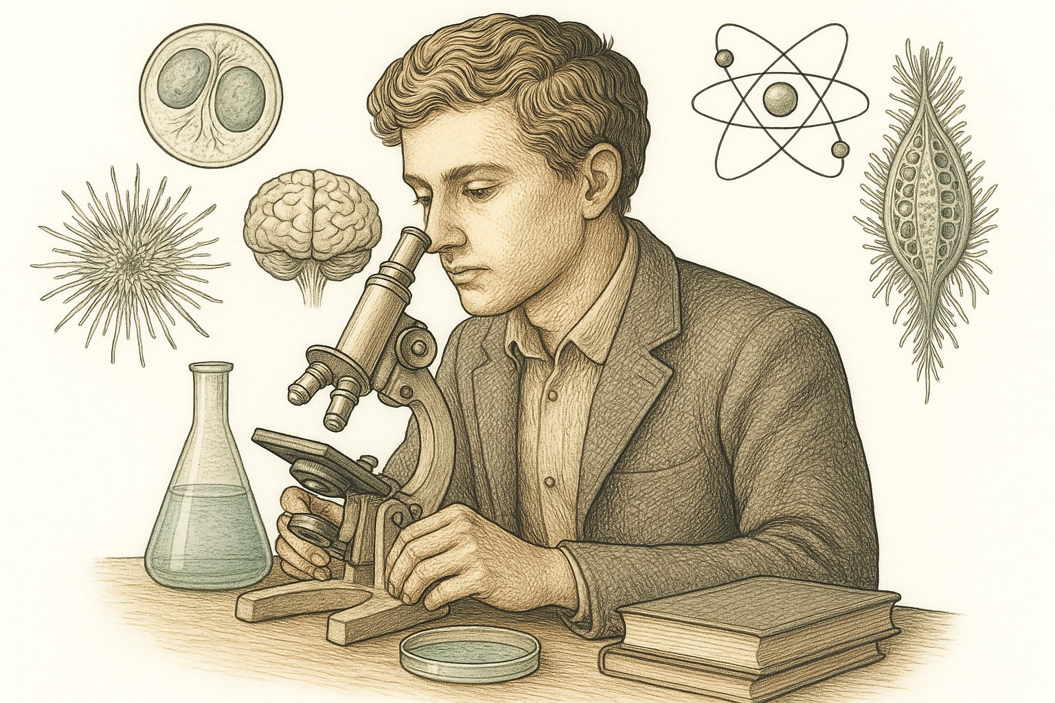
- Illustrations and Schematics: Visual explanations are excellent for methods, experimental setups, or conceptual frameworks. Custom illustrations can clarify processes that are hard to describe in words.
- Photos and Microscopy Images: When appropriate, these can provide real-world context or highlight key results. Ensure they are high-resolution and properly annotated.
- Icons and Symbols: Use simple icons to guide the eye or indicate key points, but use them sparingly to maintain professionalism.
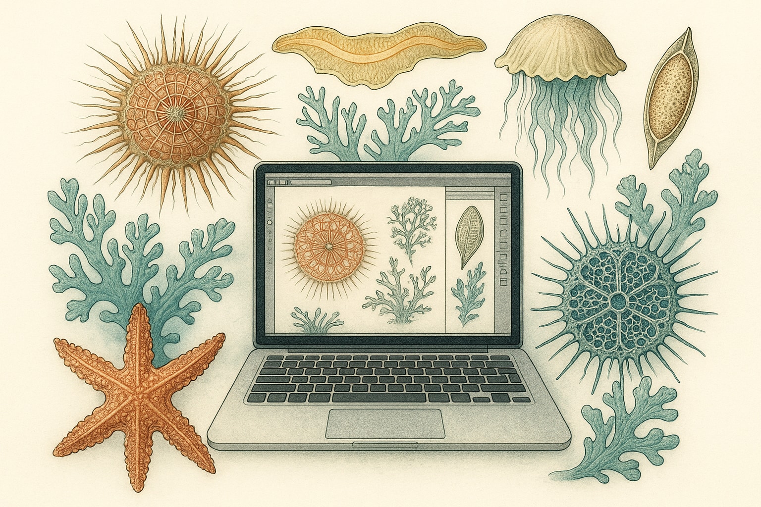
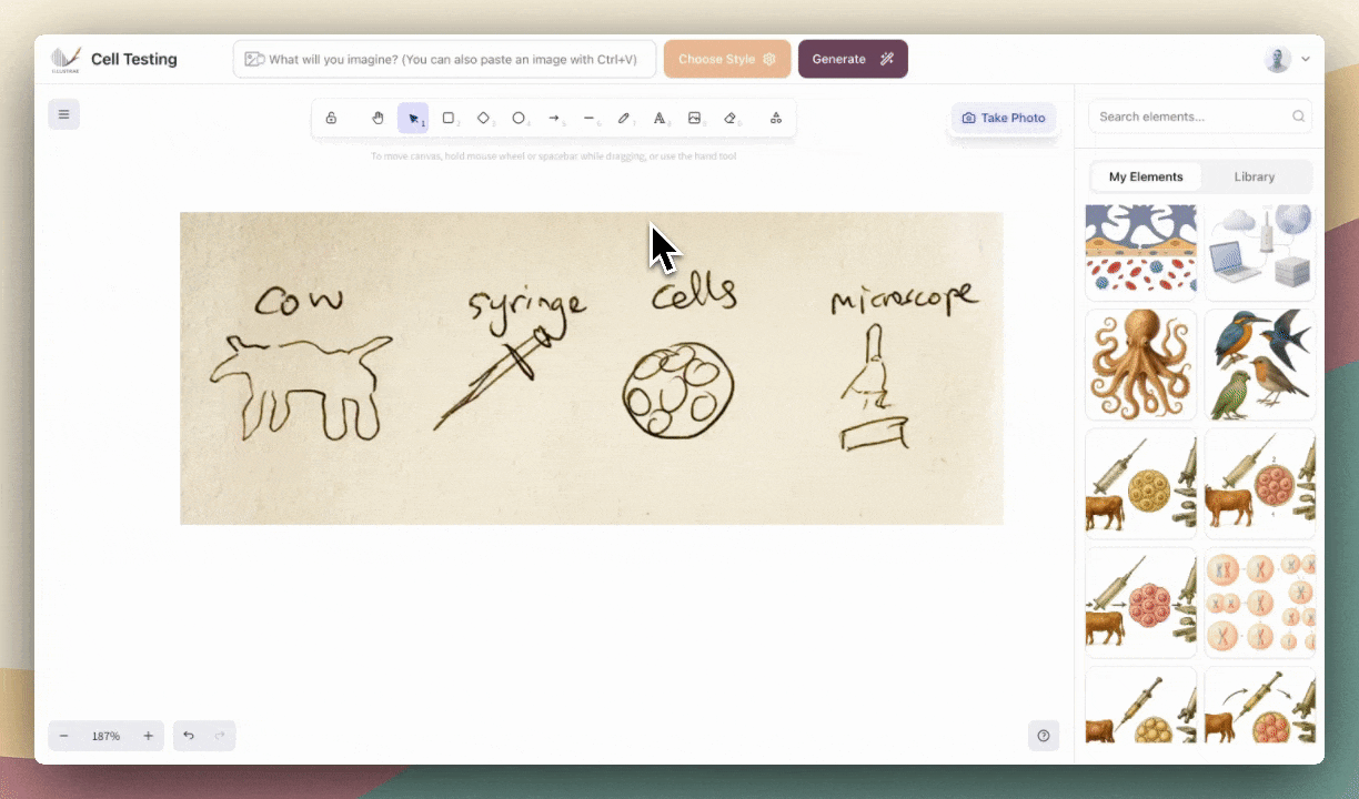
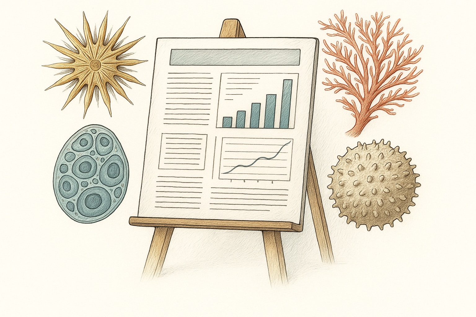
With platforms like Illustrae, generating scientific visuals has never been easier. The Intelligent Canvas lets you describe the figure, concept, or process you need, and advanced imaging technology creates custom illustrations from text, sketches, or even photos. If you need to tweak your image—say, “Make the cells pink” or “Add arrows and labels between each step”—Illustrae’s prompt bar lets you edit with a single description, saving you hours of manual editing.
Remember to keep visuals clear and not overcrowded. Each image should have a purpose and help tell your research story. Don’t forget to include brief, descriptive captions for all graphics so viewers understand what they’re looking at.
Finalizing and Presenting Your Poster
Once your layout and visuals are in place, it’s time to review, polish, and prepare for presentation. This final stage is crucial for ensuring your hard work pays off during the conference.
First, double-check your poster for clarity and accuracy. Proofread for typos, verify all figures and legends, and make sure your message comes across even without you present to explain. Show your draft to colleagues or mentors—they can spot unclear sections or mistakes you might have missed.
Here’s a checklist for finalizing your poster:
- Resolution: Export your poster at the highest resolution supported by the printer or conference guidelines. Fuzzy images or blurry text can undermine your credibility.
- File Format: Save your file in multiple formats (PDF, TIFF, etc.) as required by the conference.
- Compliance: Double-check size, orientation, and other requirements set by the event organizers.
- Accessibility: Use alt text or accessible descriptions for digital posters, and check font sizes for readability at typical viewing distances.
- Backup: Bring digital and physical backups of your poster to the conference, just in case.
Finally, practice your “poster pitch”—a 1-2 minute summary you can share with anyone who stops by. Be ready to answer questions about your methods, results, and future research directions. Remember, your goal is to engage, connect, and leave a lasting impression.
Having the right tools can make all the difference. Platforms like https://illustrae.co streamline illustration creation, allowing you to focus on your science rather than formatting. With features like the Intelligent Canvas and AI-powered editing, you can create professional, customized visuals that elevate your poster and help communicate your research clearly.
To sum up, an effective conference poster combines concise content, a clean layout, engaging visuals, and careful preparation. By following these steps and using the best tools available, you’ll ensure your research stands out and sparks valuable conversations at your next scientific meeting.